 |
Bay Six Software
Beyond the Basics
|
| The Proper Use of Color in Liberty BASIC |
| |
By Brent D. Thorn
(About 3.5 minutes to read)
Introduction
Many novice Windows programmers make some simple, yet profound, assumptions about their programs' users. Probably the most insidious mistake is to assume your users have the same display settings as you. On occasion, even the "pros" can get caught making poor color choices.
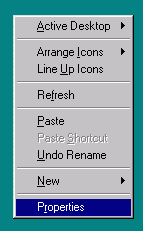
Most Windows users use the appearance settings that come with Windows. On a fresh installation, the default scheme is called "Windows Standard." You can change color schemes by right-clicking the desktop to display a menu, clicking the "Properties" menu item to display the "Display Properties" window, and then clicking on the "Appearance" tab. These actions are illustrated below.
 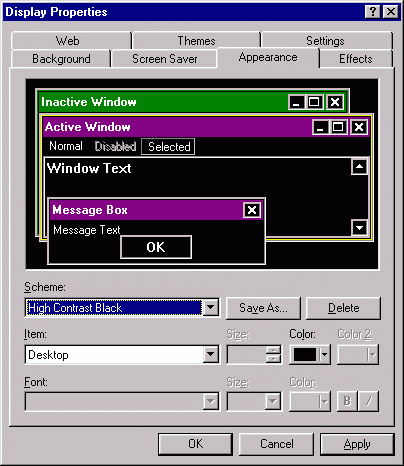
Although many people change the appearance of Windows to fit their style, some people do this out of necessity. People with vision difficulties usually prefer an appearance with more contrast than the default provides. The darkest preset color scheme is probably "High Contrast Black." This scheme gives windows (for the most part) a white-on-black look. A preview is shown in the "Display Properties" window above.
Before you change any appearance settings, you may need to save your current scheme. If you have a custom appearance that is not saved (the "Scheme" combo box shows no text), please click the "Save As" button and give it a name. If you are using Windows 98 (and possibly other later versions) and have never changed the appearance, you will lose the title bar gradient by changing to another scheme then back to "Windows Standard." Saving over "Windows Standard" will preserve this setting.
The Problem
People use color schemes like "High Contrast Black," to reduce eye irritation. However, people that need to use such color schemes get irritated by software programs that totally ignore their color choices and use black on light gray. The program is still usable to these people, but they might avoid using them if they can.
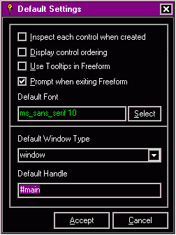
Ignoring the colors that the user chose is bad enough, but mixing "system colors" and "non-system color" inside a single window is the worst offense of all. Programs that do this can be totally unusable! Below are two screen captures of the same window. The one on the left was made using the "Windows Standard" scheme. The one on the right uses the "High Contrast Black" scheme.
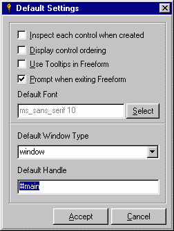 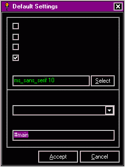
This window uses black on "buttonface" for most of its controls. With the "High Contrast Black" scheme, all the static text, along with the text of all the check boxes and the combo box is invisible! A user with this scheme using this program for the first time cannot tell what he or she is doing. Very likely, the next three actions of such a user are to click the "Cancel" button, close the program, and remove the program from his or her computer.
The Solution
For the window shown above, the solution was simply to comment out the two lines of code that set the colors.
| Code: | ForegroundColor$ = "black"
BackgroundColor$ = "buttonface" |
 Liberty BASIC has had these variables (and several more) since version 2.0. LB 2 also introduced the system color "buttonface." However, LB did not and has not added any more of these colors. Because of this, "buttonface" is effectively useless to the programmer except for some rare situations. LB 2 required a color be given, and defaulted to "black" on "buttonface." With LB 3, these variables default to the system colors. Setting any of these variables to a null string ("") sets them back to the system defaults. By commenting out the two lines of code above, the user's color scheme is enforced and the once invisible text reappears! See the fixed window on the right. Liberty BASIC has had these variables (and several more) since version 2.0. LB 2 also introduced the system color "buttonface." However, LB did not and has not added any more of these colors. Because of this, "buttonface" is effectively useless to the programmer except for some rare situations. LB 2 required a color be given, and defaulted to "black" on "buttonface." With LB 3, these variables default to the system colors. Setting any of these variables to a null string ("") sets them back to the system defaults. By commenting out the two lines of code above, the user's color scheme is enforced and the once invisible text reappears! See the fixed window on the right.
Conclusion
By avoiding mistakes with color, you can assure your program will look good on any screen. Part of your software testing regimen should be devoted to switching between some of the various appearances that come with Windows to ensure that in all cases the text is legible. Such tests take only a couple minutes and can make the difference between a usable program and a program that gets deleted. |
|
|
Powered by phpBB © 2001, 2005 phpBB Group |